BilbaoPrediction_tif<-BilbaoPrediction %>%
mutate(.pred_class=case_when(.pred_class=="Water"~1,
.pred_class=="Trees"~2,
.pred_class=="Flooded"~4,
.pred_class=="Crops"~5,
.pred_class=="Built"~7,
.pred_class=="Bare"~8,
.pred_class=="Snow"~9,
.pred_class=="Clouds"~10,
.pred_class=="Rangeland"~11))%>%
dplyr::select(x,y,.pred_class) %>%
rast(type="xyz",crs="EPSG:32630")
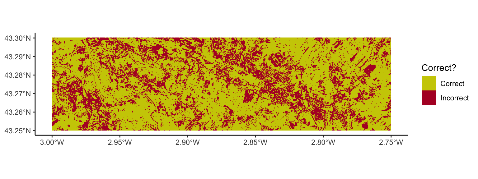
landcover_Bilbao_True<-as.factor(rast("S2Data/Bilbao_S2/T30TWN_20230925T105801_Classification.tif"))
Bilbao_Comparison<-c(landcover_Bilbao_True,BilbaoPrediction_tif) %>%
rename(Truth=`30T_20230101-20240101`,
Prediction=.pred_class)
coltab(Bilbao_Comparison[[1]])<-NULL
Bilbao_Comparison_fct<-Bilbao_Comparison %>%
mutate(Prediction=factor(case_when(Prediction==1~"Water",
Prediction==2~"Trees",
Prediction==4~"Flooded",
Prediction==5~"Crops",
Prediction==7~"Built",
Prediction==8~"Bare",
Prediction==9~"Snow",
Prediction==10~"Clouds",
Prediction==11~"Rangeland"),
levels=c("Water",
"Trees",
"Flooded",
"Crops",
"Built",
"Bare",
"Snow",
"Clouds",
"Rangeland")),
Truth=factor(case_when(Truth==1~"Water",
Truth==2~"Trees",
Truth==4~"Flooded",
Truth==5~"Crops",
Truth==7~"Built",
Truth==8~"Bare",
Truth==9~"Snow",
Truth==10~"Clouds",
Truth==11~"Rangeland"),
levels=c("Water",
"Trees",
"Flooded",
"Crops",
"Built",
"Bare",
"Snow",
"Clouds",
"Rangeland")))
ggplot()+
geom_spatraster(data=Bilbao_Comparison_fct,
maxcell = 10000000)+
scale_fill_manual(values=c("#2494a2",
"#389318",
"#DAA520",
"#e4494f",
"#bec3c5",
"#f5f8fd",
"#70543e"))+
facet_wrap(~lyr,ncol = 1)+
labs(fill="Class")+
theme_classic()